Trends · 1 min read
Design Trends Shaping Web3 and AI Brands
From liquid chrome to calm dark interfaces, the visual directions defining Web3 and AI brands right now, and how to use them without looking generic.

Dark, Calm, and Precise
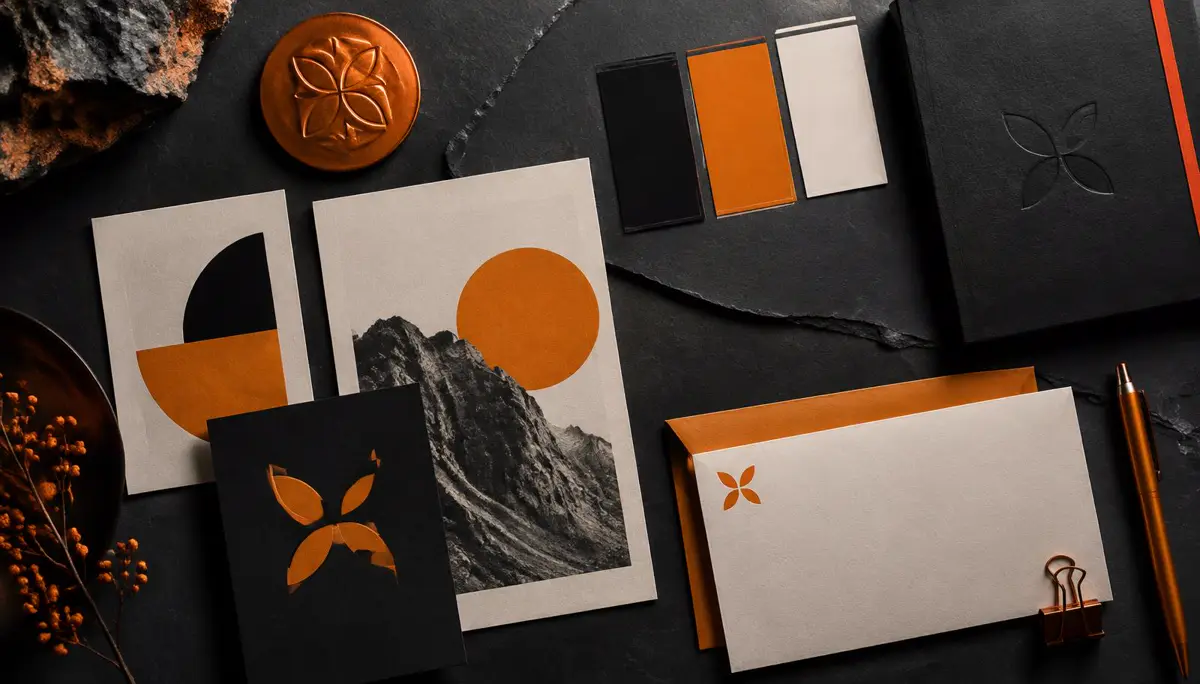
Tech brands are moving from loud neon gradients toward dark, quiet interfaces with one strong accent colour. The calm reads as confidence. A single brand colour, used sparingly for actions and highlights, does more than a rainbow ever did.
3D, Glass, and Liquid Metal
Rendered objects in chrome, frosted glass, and soft metal give abstract products a physical presence. Used well, one hero object becomes a brand symbol that works in posts, decks, and launch videos. Used everywhere, it becomes noise.
Big Type, Fewer Words
Headlines are getting larger and shorter. Oversized grotesk type with tight spacing carries the message, while supporting copy shrinks. It suits fast-scrolling feeds where a launch has a second or two to land.
Motion as Identity
Brands now define how they move as carefully as how they look: easing curves, reveal styles, and logo animations. Consistent motion ties a website, a product, and a social clip into one recognisable system.
Trends Are Tools, Not a Brand
The risk is looking like everyone else. Pick the one or two trends that fit your story, then anchor them in your own mark, colour, and voice. That is how a brand stays current without becoming a template.