Web3 · 2 min read
Web3 Website Design: A Pre-Launch Review Checklist
Review your Web3 website's product story, official links, mobile layout, accessibility and performance before launching a campaign.
Review the website as a visitor, not a presentation
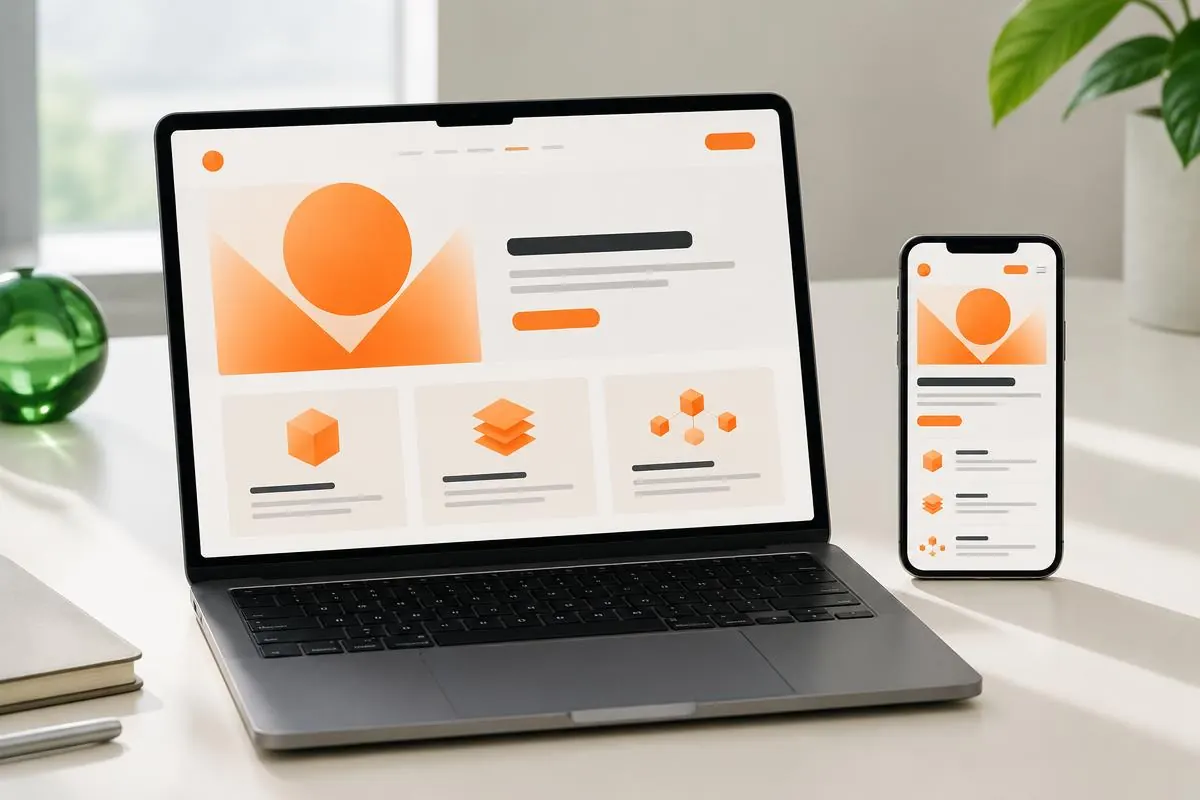
A Web3 website has to explain a product before its visual direction can persuade anyone to explore it. Start with one task: a new visitor wants to understand what the project does and find the next sensible step. Open the actual site on a phone, not just a design file. Read the headline and supporting copy aloud. If the explanation depends on unexplained token vocabulary, rewrite it around the product's purpose. A striking 3D scene should support that explanation rather than become the only thing the visitor remembers.
Check the journey from campaign to documentation
Follow a real launch link through the website to documentation, supported networks and product information. Check that names and descriptions match. Make official routes easy to identify and remove broken or outdated destinations. Separate an exploration action from an action that opens a wallet. Ethereum.org's Web3 interface heuristics emphasise terminology and feedback; those concerns begin before the transaction screen. Someone researching the project should be able to learn without being asked to sign anything prematurely.
Give each section one useful job
A product explanation, supporting evidence and primary action need different visual roles. Do not repeat the same vague promise in every band of the page. Use an actual product view where visitors need to inspect the interface, and label conceptual demonstrations appropriately. Keep important limitations close to the claim they qualify. If your site mentions audits or partnerships, link to relevant evidence and describe its scope. A well-designed layout can make evidence easier to find, but cannot create evidence that does not exist.
Test content that does not fit the mockup
Try long navigation labels, a full product name, larger text settings and translated copy if you support it. Inspect the narrowest phone layout. Make sure controls remain tappable and that text does not collide with artwork. Check the menu, contact form and all error messages with the keyboard as well. WCAG 2.2 provides criteria for accessible contrast, focus, labels and interaction. Automated checking is useful, but a real task review will reveal problems that isolated screens and attractive screenshots miss.
Budget the opening animation
Use a clear initial state while a heavy scene loads, and keep navigation available independently. Reserve space for images so their arrival does not shift important content. Avoid lazy-loading the main image people need in the opening view. Measure both loading and subsequent interaction on an ordinary phone. web.dev's LCP guidance describes how image delivery and render delays affect the main content appearing; a small asset alone does not guarantee a fast experience. Keep a reduced-motion alternative that preserves the page's meaning.
Finish with a launch acceptance checklist
Record the product explanation, official-link review, mobile checks, accessibility findings and loading observations before approving launch. Assign someone to each unresolved issue rather than leaving a general request to polish the site. At MRL Creation, portfolio entries such as Poster and Trailers combine interface, brand and launch-related deliverables; use those examples to discuss the actual scope you need. Publish only claims your team can support, then review customer questions after launch to see what still needs explanation.