
Web3 · 1 min read
Web3 Onboarding: Designing the First Wallet Moment
The first wallet connection is where most Web3 users drop off. Practical design patterns to make onboarding clear, safe, and fast.
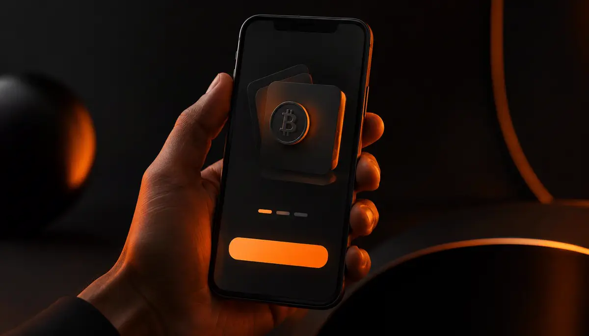
The Moment That Decides Everything
For many people, connecting a wallet is the first real step into your product, and the most likely point to leave. Unfamiliar pop-ups, long addresses, and signing requests feel risky. Design has to make that moment feel guided and safe.
Explain Before You Ask
Tell users what will happen before the wallet opens: what they are signing, why, and what it costs. One short line of plain language next to the button removes more fear than any tooltip. Never ask for a signature without context.
Let People Look Around First
Let visitors explore the product before they connect. Show real content, demo states, or a guided preview, and ask for the wallet only when it unlocks something they want. Value first, connection second.
Make Every State Visible
Pending, confirmed, failed, and wrong network all need their own clear state. Use consistent colour, short labels, and motion that shows progress. Users should never wonder whether a transaction went through.
Design Once, Reuse Everywhere
Build onboarding as a small system of components: connect buttons, status chips, and confirmation cards that share one style. It keeps the experience consistent as the product grows and makes the brand recognisable at the most sensitive moment.